


Designing O2O (Online-to-Offline) Experiencewith Gamification for Real-World Social Connections
Entertainment - Japan market - UI/UX Design - 1 Senior UI UX Designer - 2 months
This project started with a very different ambition.
Our client envisioned a mobile-responsive Web App where digital conversations would not end in endless messaging threads. Instead, users could discover people nearby, build confidence through interaction, and eventually meet in real life.
Newwave Solutions was brought in to design the full UI/UX and visual identity for this platform. Through proximity-based discovery, venue exploration, social gifting, a gender-based point system, and safety mechanisms, the experience was crafted to feel less like a messaging tool and more like the beginning of a real-world social outing.
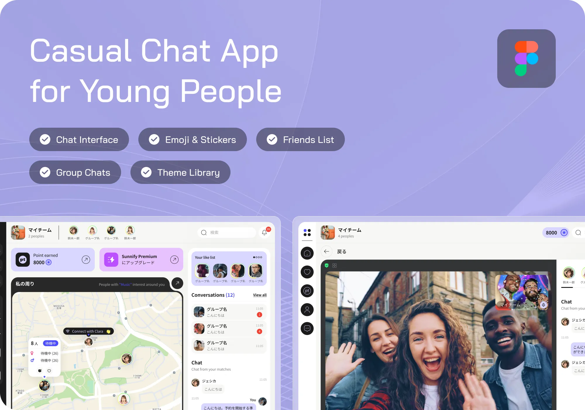
Client Context
Operating in the entertainment industry, the client aimed to launch a two-sided social platform tailored for the Japanese market.
The vision extended beyond messaging. The platform needed to support:
• Users discovering nearby people and interacting through chat
• Sending virtual gifts and earning/spending points
• Exploring venues and booking private spaces
• Safety features for real-world meetups
• B2B partner onboarding, where restaurants and bars could register and manage rentable spaces
The design scope focused entirely on UI/UX across mobile browsers and in-venue iPad devices. The challenge was not just feature richness, but creating a cohesive experience that felt exciting, trustworthy, and easy to navigate across contexts.


Business Challenges
At its core, the product addressed a behavioral gap: moving users from online interaction to offline action. Several challenges emerged
Overly expressive interactions could confuse users, while a plain interface could weaken engagement.
Users needed to feel motivated, but not pressured, to meet in real life.
The platform had to support both end-users and venue partners with distinct journeys.
Lack of trust could prevent users from transitioning offline.
Gender imbalance could disrupt engagement if not carefully managed through incentives.
Users interacted via personal devices and venue tablets, requiring adaptable UX patterns.
Our Approach
Rather than designing a typical chat interface, Newwave Solutions approached the project as an O2O experience design challenge powered by gamification.
The team mapped the emotional journey: A user notices someone nearby → hesitates → starts chatting → sends a drink → explores a venue → considers meeting.
Each step represented a psychological transition, and every screen was designed to support that progression.
Three guiding principles emerged:
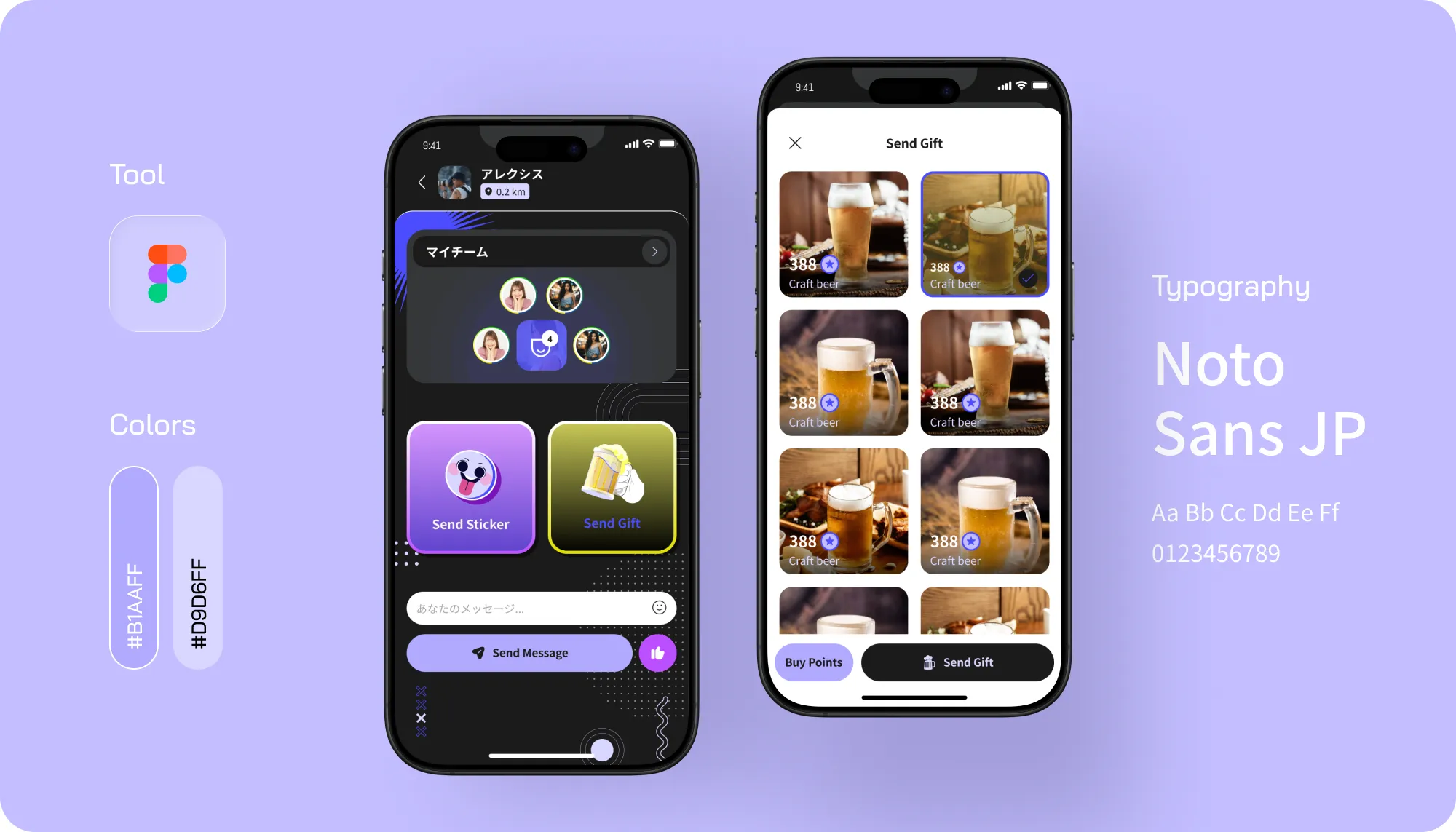
• Make social intent feel natural: Translate real-world gestures like buying a drink into intuitive digital interactions.
• Design for trust and comfort: Integrate safety signals such as verified venues, reviews, and reporting flows.
• Create an atmosphere of movement: Build a dynamic, location-based interface that reflects real-world social energy.
Design Decisions
Once the emotional journey was defined, the visual and interaction design decisions were built around the product's real-world social environment.
A key UX innovation was the in-venue iPad + QR code onboarding flow.
Instead of requiring users to download an app or go through lengthy registration, visitors at partner venues can simply scan a QR code displayed on the venue’s iPad. Within seconds, they are connected to the platform and can start discovering nearby users, sending drinks, or joining ongoing social interactions.
This low-friction onboarding dramatically reduces drop-off, aligns with spontaneous nightlife behavior, and bridges the gap between physical presence and digital interaction, making the O2O experience truly seamless.
To maintain a healthy platform ecosystem, we designed an asymmetrical, gamified point system tailored to Japanese matchmaking dynamics: female users earn points for active participation, while male users utilize points (purchasable at 1 JPY/point or via tiered subscription packages starting from 1,900 JPY) to interact, gift drinks, or book private rooms.
This mechanism serves multiple purposes. It helps balance gender participation within the ecosystem while encouraging sustained engagement from female users. At the same time, it establishes a monetization model that aligns closely with user behavior and maintains a healthy supply-demand dynamic.

Dual-context visual system
Ensured usability across mobile browsers and in-venue tablets

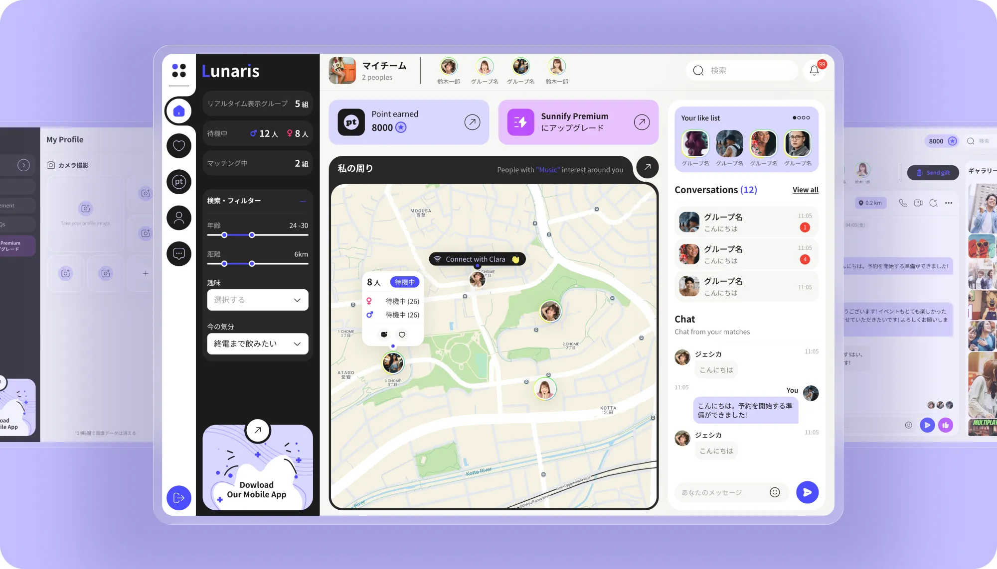
Interactive map navigation
Positioned the map as the core discovery layer for users and venues

Venue tablet hero-screen flow
Simplified onboarding via QR login and venue-specific actions

Micro-interactions and haptic cues
Reinforced engagement through tactile feedback in gifting and matching

Adaptive typography and spacing
Maintained readability across different environments
The project was delivered under a flexible Labo (Time & Materials) model, allowing continuous iteration and adaptation to evolving requirements. The team included one Senior UI/UX Designer working over a two-month engagement, collaborating in an Agile manner with frequent feedback loops. This approach enabled rapid refinement of user flows, ensured close alignment with client expectations, and supported iterative validation of complex interaction patterns.
Our Roles
This project's biggest risk was encouraging offline meetings too aggressively.
If users felt pressured to meet before establishing trust, adoption could suffer. On the other hand, introducing too many reassurance mechanisms could make the experience feel restrictive and undermine the spontaneity that makes social discovery enjoyable.
To balance these competing needs, trust was embedded throughout the journey rather than concentrated in a single step.
Group photos, venue information, post-meeting reviews, and incident reporting tools provided reassurance at key moments. At the same time, playful interactions such as gifting and location-based exploration preserved the sense of excitement that users expected from an entertainment-focused platform.
This balance allowed the product to feel both comfortable and socially engaging.
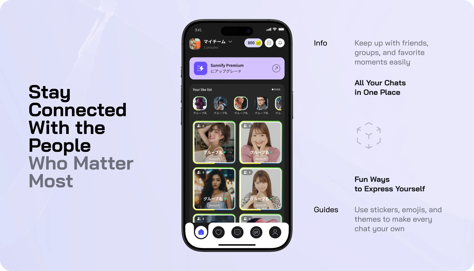
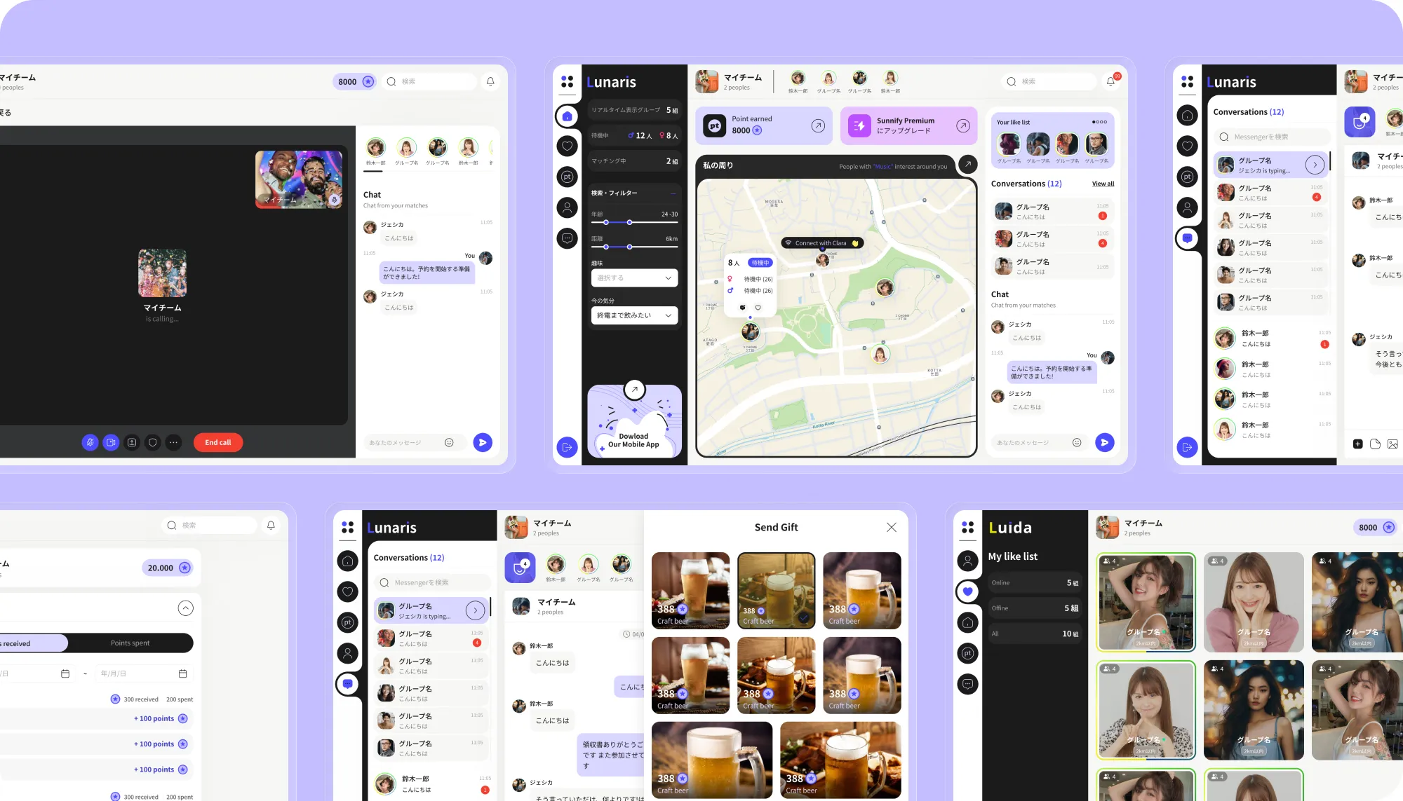
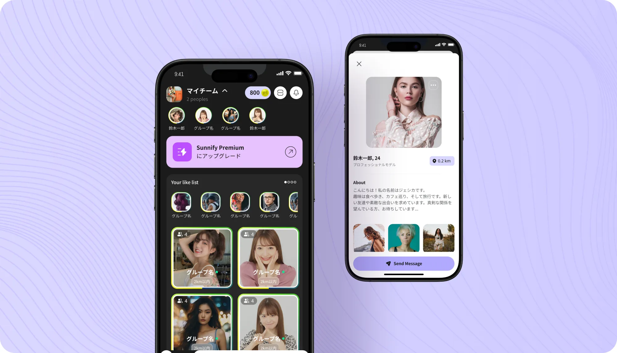
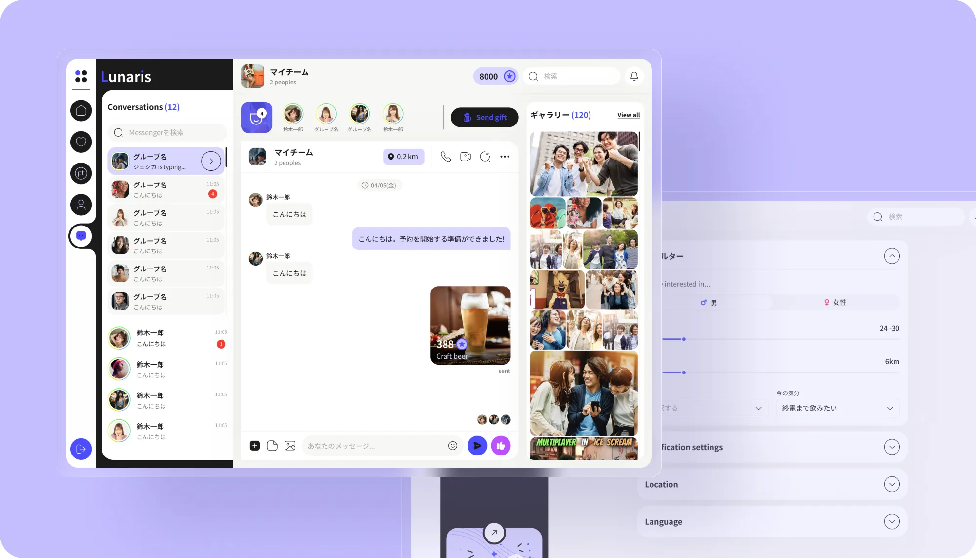
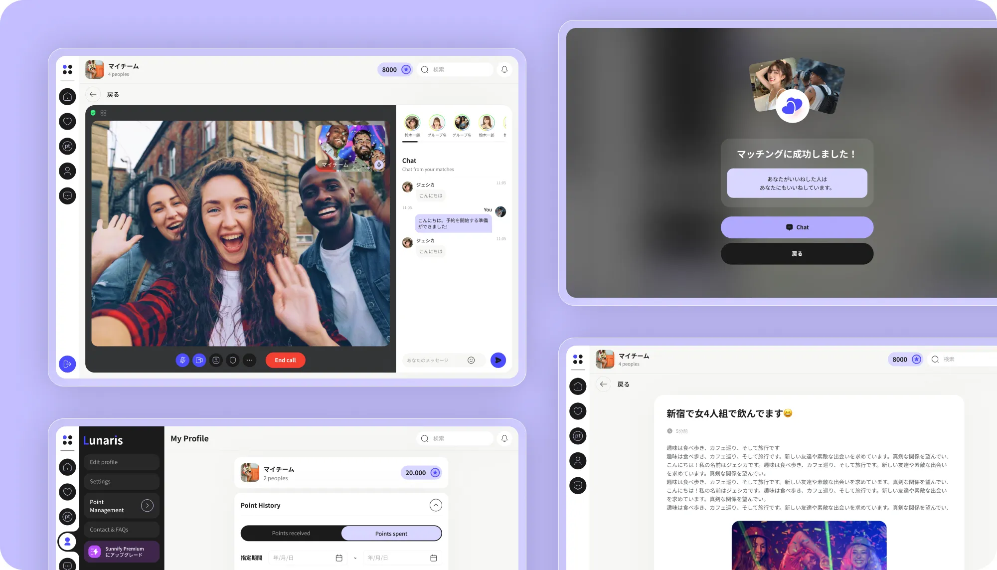
Platform Highlights
Users could discover others within a 1 to 10 km radius, increasing opportunities for nearby real-world meetups.
The “Send a Drink” feature gave users a natural way to break the ice and start conversation.
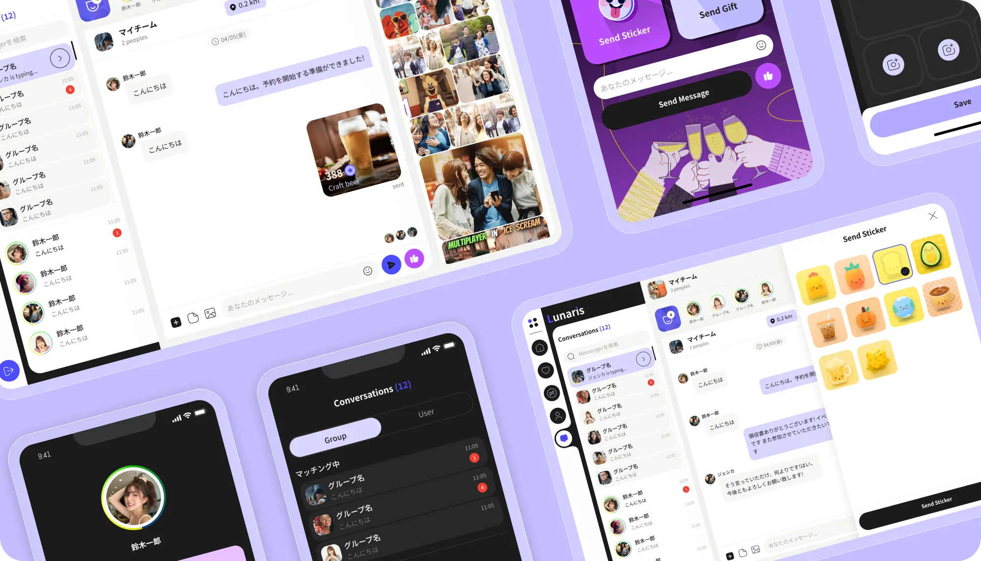
Supports both user booking and merchant registration for private venue spaces.
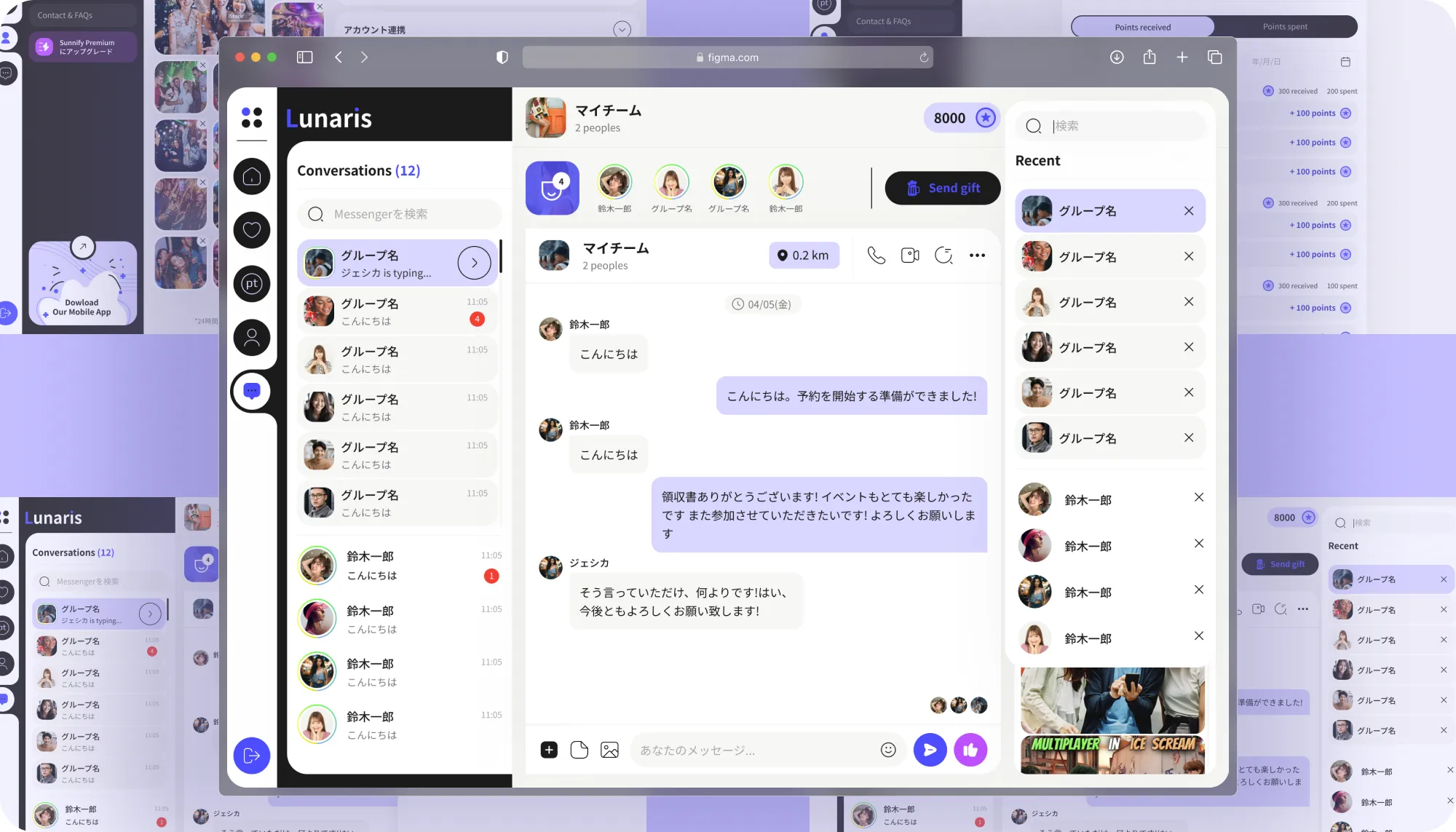
Users explore and book venues using reward points.
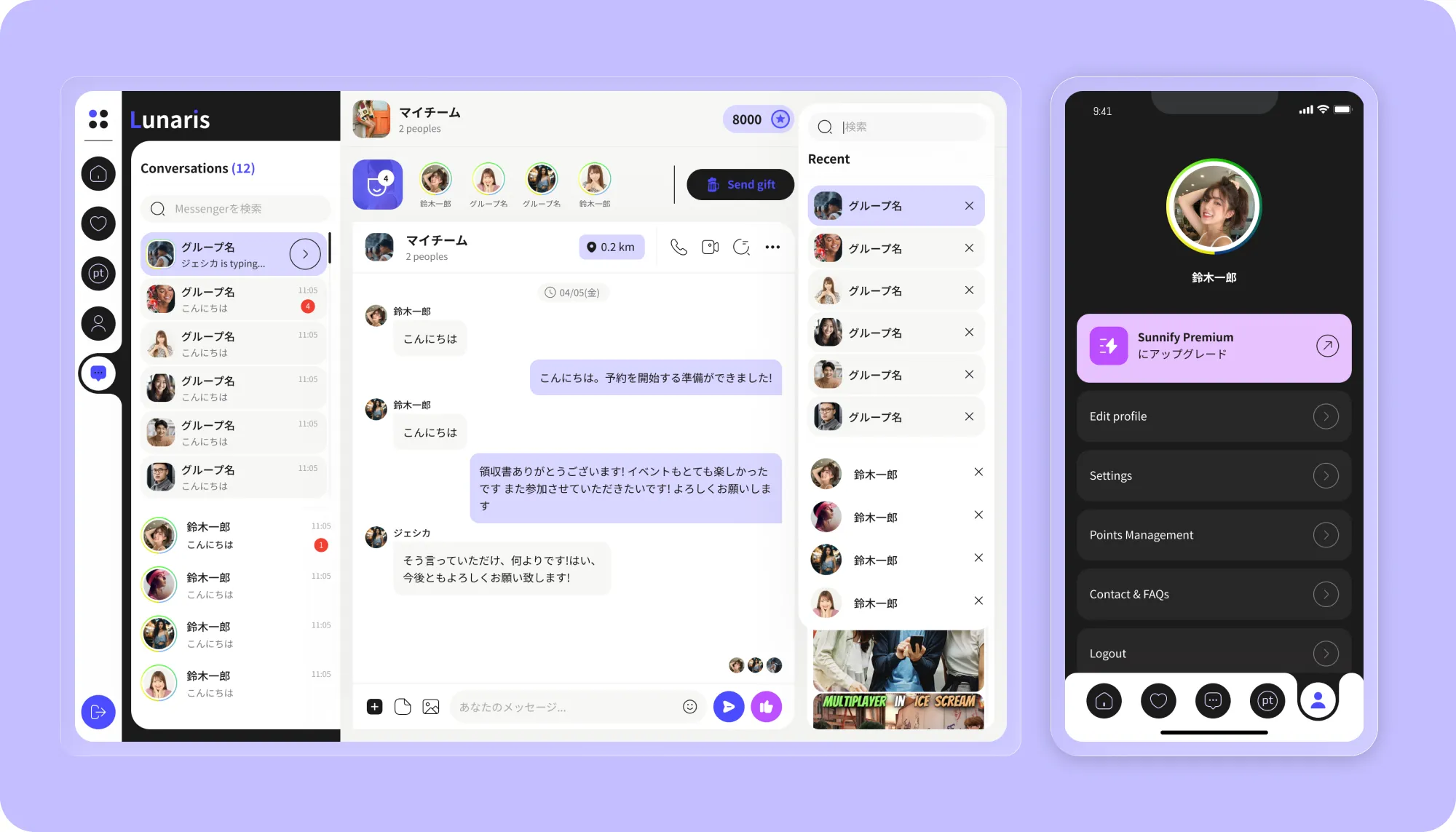
Gender-based earning/spending model maintains ecosystem balance and monetization.
Reviews and reporting enhance trust.
Seamless experience across mobile browsers and in-venue tablets.
Business Impact
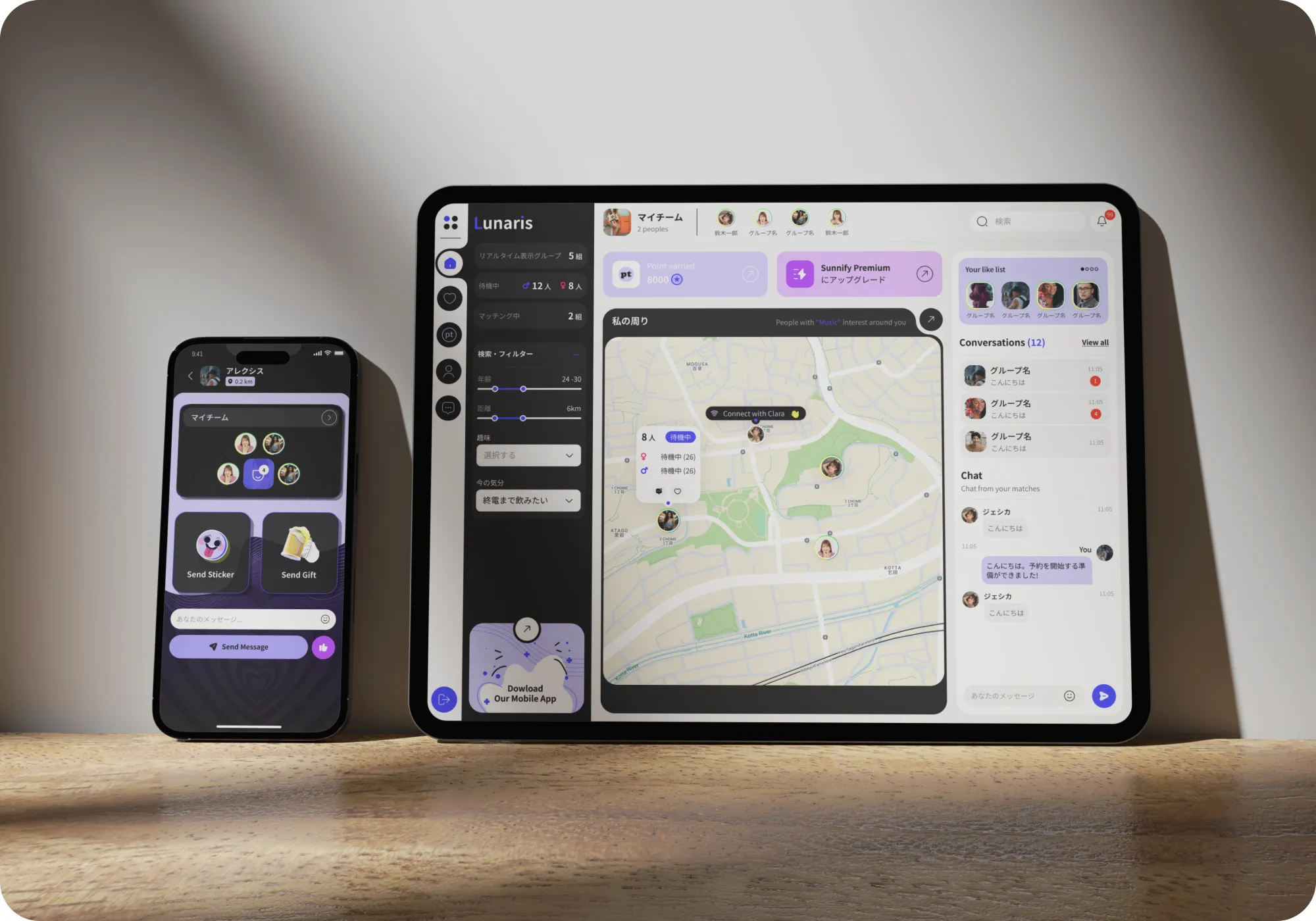
Matching became the starting point, while gifting, venue discovery, rewards, and community features provided the structure needed to support offline interaction.
- Our client: The design met project quality expectations and organized social, venue, reward, and community-related features into a cohesive user experience.
- Users: The experience felt more intentional and immersive than traditional chat applications. Every feature contributed to helping people move from digital engagement toward offline interaction.
- Partner venues: Venue discovery, booking flows, reward redemption, and tablet-based interactions helped connect online engagement with physical locations.
Most importantly, the design transformed a complex collection of features into a journey that felt intuitive. Users did not need to think about matching systems, rewards, venue integrations, or reporting workflows separately. They simply followed a natural path from discovering someone nearby to deciding whether to meet.
The design met project quality expectations and made a complex social, venue, reward and safety feature set easier to understand.
Related Case Study


Let’s Build Something Extraordinary
Sign up for a 30 min no-obligation strategic session with us. Transform your Ideas into scalable reality.