What is Bootstrap? A Leading Front-End Framework

In today’s digital landscape, where users access websites from countless devices and screen sizes, creating responsive, visually appealing web interfaces has become more challenging than ever. This is where understanding what is Bootstrap becomes crucial for developers and businesses alike. As the world’s most popular front-end framework, Bootstrap has revolutionized how websites are built, offering a comprehensive toolkit that streamlines development while ensuring consistency across all platforms. This comprehensive guide explores Bootstrap’s capabilities, from the latest Bootstrap 5.3 features to practical components like Bootstrap table and Bootstrap button elements that make modern web development accessible to everyone.
What is Bootstrap?
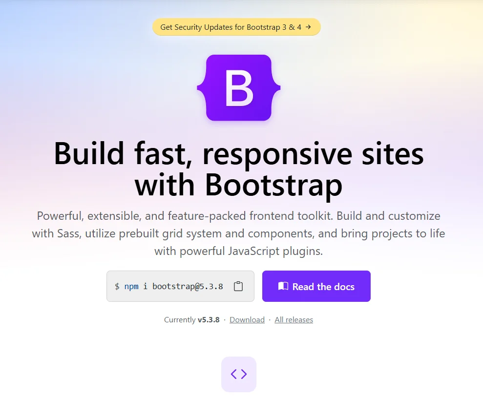
Bootstrap is a free, open-source front-end framework that provides a collection of pre-designed HTML, CSS, and JavaScript components for building responsive, mobile-first websites and web applications. Originally developed by Twitter engineers and now maintained by a large community, Bootstrap has evolved through multiple versions, with Bootstrap 5 representing the most current iteration that removed jQuery dependency and introduced modern features.

So, what is Bootstrap in practical terms? Think of it as a massive toolbox filled with pre-built website components that developers can use instead of building everything from scratch. The framework includes everything from basic typography and forms to complex navigation bars, modals, and carousels, all designed to work seamlessly across different devices and browsers. This comprehensive approach makes Bootstrap invaluable for custom web development services that need to deliver consistent results quickly without compromising on quality or responsiveness.
Key Characteristics of Bootstrap:
- Mobile-First Approach: Designed for mobile devices first, then scaled up for larger screens
- Component-Based Architecture: Pre-built elements that can be easily customized and combined
- Responsive Grid System: 12-column flexible layout system that adapts to any screen size
- Cross-Browser Compatibility: Thoroughly tested to work consistently across all modern browsers
- Extensive Documentation: Comprehensive guides and examples for every component
Bootstrap Origin: The History and Evolution
Bootstrap was born in 2011 at Twitter, created by developers Mark Otto and Jacob Thornton to address internal challenges with consistency and efficiency in their development process. Initially called “Twitter Blueprint,” it was designed as a framework to help Twitter’s developers work more consistently across different projects. When it was open-sourced in August 2011, it quickly gained popularity beyond Twitter’s walls.
The framework has undergone significant evolution through major versions:
- Bootstrap 2 (2012): Added the responsive 12-column grid system
- Bootstrap 3 (2013): Shifted to a mobile-first approach
- Bootstrap 4 (2018): Major rewrite with Sass support and flexbox
- Bootstrap 5 (2020-2023): Dropped jQuery dependency, added custom CSS properties, and improved utilities
Bootstrap’s Global Impact on Web Development
Bootstrap fundamentally transformed how websites are built by democratizing responsive web design. Before Bootstrap, creating mobile-friendly websites required significant expertise in CSS media queries and cross-browser compatibility. The framework made responsive design accessible to developers of all skill levels, effectively setting new standards for what users expect from web experiences across devices.
The framework’s impact extends beyond just code; it created an entire ecosystem of templates, themes, and UI kits that further accelerated web development. This ecosystem enabled software development services to deliver professional results faster and more consistently, while also providing a common language that hiring front-end developers could use across different projects and organizations.
So, why is Bootstrap important?
Bootstrap’s importance stems from its ability to solve fundamental challenges in web development while setting new standards for efficiency, consistency, and accessibility in digital product creation:
- Consistent Coding Standards: Provides a unified approach to building interfaces that teams can follow
- Best Practices Integration: Embodies modern web development principles like mobile-first design
- Reduced Learning Curve: New team members can become productive quickly with familiar patterns
- Industry Benchmark: Sets quality standards that influence other frameworks and development approaches
Why Many Businesses Choose Bootstrap?
Businesses choose Bootstrap because it significantly reduces development time and costs while ensuring professional, consistent results across all devices and platforms, making it ideal for projects with tight deadlines and budget constraints:
1. Rapid Development and Time Savings
Bootstrap’s pre-designed components and templates enable developers to build websites up to 50% faster than coding from scratch. The framework’s extensive library of UI elements means that common features like navigation menus, forms, buttons, and cards can be implemented in minutes rather than hours. This accelerated development process is particularly valuable for software development services working on multiple client projects or internal tools that need to be delivered quickly without sacrificing quality.
2. Consistent Design and User Experience
The framework enforces design consistency throughout an application, ensuring that all elements follow the same visual language and interaction patterns. This consistency improves user experience by creating familiar interfaces that are easy to navigate and understand. For businesses building web app development solutions that will be used by diverse audiences, Bootstrap’s standardized components help maintain brand identity and usability standards across all pages and features.
3. Mobile-Responsive by Default
With mobile internet usage surpassing desktop, Bootstrap’s mobile-first approach ensures that websites look and function perfectly on all devices automatically. The framework’s responsive grid system and components adapt seamlessly to different screen sizes, eliminating the need to create separate versions for mobile and desktop. This built-in responsiveness is crucial for businesses targeting modern consumers who expect flawless experiences regardless of their device.
4. Large Community and Resources
Bootstrap’s massive community provides extensive support, tutorials, and third-party resources that extend its capabilities. This ecosystem means that developers can find solutions to almost any problem quickly, and businesses can easily find talent familiar with the framework. The availability of hired front-end developers with Bootstrap expertise makes it a safe long-term choice for organizations building their web presence.
What is Bootstrap Used For?
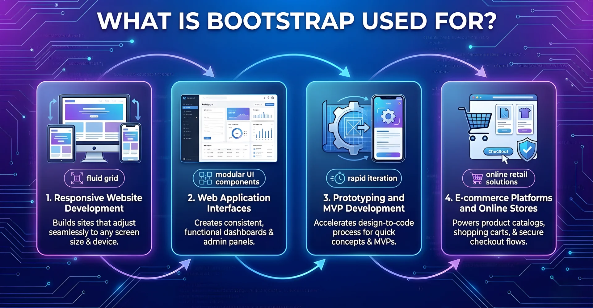
Bootstrap is used for building virtually any type of website or web application, from simple marketing pages to complex admin dashboards, providing a solid foundation that ensures responsiveness and visual consistency.

1. Responsive Website Development
Bootstrap serves as the foundation for creating websites that automatically adapt to different screen sizes and devices. The framework’s grid system and responsive utilities make it straightforward to build layouts that reorganize content appropriately for desktops, tablets, and smartphones. This capability is essential for custom web development services creating business websites, portfolios, and marketing sites that need to reach audiences across all devices without compromising user experience.
2. Web Application Interfaces
The framework is extensively used for building the user interfaces of web applications, particularly admin dashboards, control panels, and data management systems. Components like Bootstrap table elements, form controls, and navigation patterns provide the building blocks for creating functional, intuitive application interfaces. Many web app development solutions leverage Bootstrap to ensure their interfaces are both aesthetically pleasing and highly usable, with consistent interaction patterns that reduce user learning curves.
3. Prototyping and MVP Development
Bootstrap excels in rapid prototyping and minimum viable product (MVP) development, allowing teams to quickly create working prototypes to validate ideas and gather feedback. The framework’s pre-styled components enable developers to build functional prototypes in hours rather than days, making it ideal for startups and enterprises testing new concepts before investing in fully custom development. This rapid iteration capability aligns perfectly with agile development methodologies.
4. E-commerce Platforms and Online Stores
Online retailers use Bootstrap to create responsive product catalogs, shopping carts, and checkout processes that work seamlessly across all devices. The framework’s component library includes elements specifically useful for e-commerce, such as product cards, pricing tables, and responsive image galleries. The flexibility of Bootstrap 5 particularly enhances e-commerce development with improved form controls and interactive elements that improve the shopping experience.
>> Explore more of what our dedicated team can do for eCommerce Web Development Services
How Does Bootstrap Work?
Bootstrap works through a combination of a responsive grid system, pre-designed CSS classes, and JavaScript plugins that together provide a comprehensive framework for building modern, responsive web interfaces with minimal custom coding.
The Grid System and Layout Foundation
At the core of Bootstrap is its responsive 12-column grid system that forms the structural foundation of every layout. Think of this grid as a flexible container system that automatically rearranges content based on screen size. Developers use simple CSS classes like .container, .row, and .col-md-6 to create complex layouts that adapt from mobile to desktop seamlessly. The Bootstrap flex utilities further enhance this system by providing powerful alignment and distribution controls that work in conjunction with the grid.
CSS Components and Styling
Bootstrap includes an extensive set of pre-styled components that can be activated simply by adding the appropriate CSS classes to HTML elements. For example, adding class=”btn btn-primary” to a button element instantly styles it with Bootstrap’s default primary button appearance, complete with hover effects and proper padding. This class-based approach applies to everything from typography and forms to complex components like navigation bars and cards. The Bootstrap CDN (Content Delivery Network) makes these styles readily available by serving the framework’s CSS files from fast, globally distributed servers.
JavaScript Interactivity
Bootstrap enhances its CSS components with lightweight JavaScript plugins that add interactivity without requiring custom coding. These plugins handle common interactive patterns like modal dialogs, dropdown menus, carousels, and tabbed interfaces. The latest Bootstrap 5.3 version has optimized these plugins for better performance and removed the jQuery dependency, making them lighter and more modern. A Bootstrap button can easily trigger a modal window by simply adding data-bs-toggle=”modal” attributes, demonstrating the framework’s declarative approach to adding functionality.
Customization and Theming
While Bootstrap provides sensible defaults, it’s designed to be fully customizable through Sass variables and CSS custom properties. Developers can easily modify colors, spacing, typography, and component-specific styles to match brand guidelines without breaking the core framework. This customization system allows custom web development services to create unique designs that maintain all the benefits of Bootstrap’s responsive foundation while expressing specific brand identities.
Advantages and Disadvantages
Bootstrap offers significant advantages in development speed and consistency, but faces challenges regarding design uniqueness and file size that organizations must consider for their specific projects.
Advantages
- Rapid Development: Pre-built components and templates accelerate development by up to 50% compared to coding from scratch
- Responsive by Default: Mobile-first grid system ensures websites work perfectly on all devices without extra effort
- Consistent Design: Standardized components create unified user experiences across entire applications
- Cross-Browser Compatibility: Extensive testing ensures consistent performance across all modern browsers
- Strong Community Support: Massive ecosystem provides endless resources, tutorials, and third-party extensions
Disadvantages
- Similar-Looking Websites: Heavy reliance on default styles can result in generic-looking designs without significant customization
- File Size Overhead: Including the entire framework adds unnecessary bulk if only using a small subset of features
- Learning Curve: Understanding the class naming conventions and grid system requires initial investment
- Overriding Styles: Custom designs often require overriding default styles, which can become messy without proper organization
Conclusion
We’ve explored what is Bootstrap and why it remains an essential tool in modern web development. From its responsive grid system and pre-built components to the latest features in Bootstrap 5.3, the framework provides a solid foundation for building websites and applications that work beautifully across all devices. While alternatives exist, Bootstrap’s maturity, extensive documentation, and massive community continue to make it the go-to choice for developers and businesses seeking to balance development speed with quality results.
Whether you’re building marketing sites, web applications, or complex enterprise tools, Bootstrap provides the tools to create professional, responsive interfaces efficiently. As web technologies continue to evolve, Bootstrap’s commitment to modern standards like flexbox and CSS variables in Bootstrap flex utilities ensures it remains relevant for future projects.
Ready to build responsive, professional websites with Bootstrap? Contact us today to leverage our expertise in front-end development and discover how our hire front-end developers services can bring your web projects to life with efficiency and precision. Let us help you create stunning web experiences that engage your audience across all devices.
To Quang Duy is the CEO of Newwave Solutions, a leading Vietnamese software company. He is recognized as a standout technology consultant. Connect with him on LinkedIn and Twitter.

Read More Guides
Get stories in your inbox twice a month.
Let’s Connect
Let us know what you need, and out professionals will collaborate with you to find a solution that enables growth.


Leave a Reply