


Mobile Web Development: Framework, Languages & More

The way we access information and complete tasks online has been dramatically transformed by the surge of mobile devices. From smartphones to tablets, these handy companions have become an extension of ourselves. This shift in user behavior has made mobile web development a critical aspect of any successful online presence.
This guide will equip you with the essential knowledge for mobile web development, including the definition, building frameworks, programming languages, and especially how to create a mobile-friendly website from scratch. Don’t miss any news if your business is looking to boost its online presence on mobile platforms.
What is Mobile Web Development?
Mobile web development focuses on building websites that are optimized for smartphones and tablets by ensuring fast load times, adaptive layouts, and a smooth user experience. It involves responsive design, efficient navigation, and touch-friendly interfaces that work across all mobile browsers.
When someone mentions “mobile web”, they refer to websites or web applications specifically designed for smartphones or tablets. Unlike traditional desktop websites, which may not display properly on smaller screens, these forms are tailored to accommodate mobile devices’ unique constraints and capabilities.

Mobile Web vs Mobile App Development: Which is better?
In today’s mobile-first business landscape, choosing between Mobile Web and Mobile App development is a pivotal decision that directly impacts your enterprise’s user experience, development timeline, and ROI. The comparison below highlights key differences across critical factors, with verdicts to guide which option best suits specific business needs:
|
Comparison Criteria |
Mobile Web |
Mobile App |
Verdict (Winner) |
| Development Cost | Lower upfront costs (~$10K-50K) using responsive frameworks like Bootstrap or React; single codebase for all devices. | Higher costs (~$50K-250K+) due to native iOS/Android development or cross-platform tools like Flutter/React Native. | Mobile Web for budget-conscious startups. |
| Development Time | Faster deployment (2-6 weeks) with HTML/CSS/JS; quick iterations via browser updates. | Longer timelines (3-12 months) for app store approval, platform-specific builds, and testing. | Mobile Web for rapid market entry. |
| Performance | Good for content-heavy sites but slower on heavy JS (e.g., 2-5s load times on 3G); limited hardware access. | Superior speed via native code (sub-1s loads); full GPU acceleration and device API integration. | Mobile App for high-interaction experiences. |
| User Engagement | Relies on bookmarks/SEO; average session ~2-3 mins; no persistent presence. | Push notifications boost retention 3-5x; average 10+ mins/session; home screen icon for instant access. | Mobile App for loyalty-building. |
| Offline Capability | Limited (basic caching via Service Workers in PWAs); requires internet for core functions. | Full offline mode with local storage/databases; syncs on reconnect. | Mobile App for field services/travel apps. |
| SEO & Discoverability | Excellent Google indexing; drives 60%+ organic traffic via mobile search. | App Store optimization only; no web crawling, relies on paid ads/downloads. | Mobile Web for organic growth. |
| Maintenance & Updates | Instant over-the-air updates; no app store review delays. | Manual updates via stores (1-7 day approval); users must download (~30% skip). | Mobile Web for agile iterations. |
| Monetization | Ads, affiliate links; seamless e-commerce checkout. | In-app purchases, subscriptions (88% revenue share); premium features. | Mobile App for high-margin models. |
| Cross-Platform Reach | Universal access via any browser; no install barrier (95%+ reach). | Platform silos (iOS/Android); 20-30% drop-off in downloads. | Mobile Web for broad accessibility. |
As you can see, each has its strengths and weaknesses. The decision between mobile website development and mobile app development depends on various factors, including your specific goals, target audience, budget, and required features.
When Enterprises Should Choose Mobile WEB Development:
- Budget constraints or MVP launch: Opt for Mobile Web when rapid deployment under $50K is critical for startups testing market fit without app store delays.
- SEO-driven organic growth: Choose Mobile Web for content-heavy businesses like e-commerce or media needing Google mobile-first indexing to capture 60%+ search traffic.
- Broad audience reach: Select Mobile Web for global accessibility via any browser, ideal for B2B services or info portals with no install friction.
When Enterprises Should Choose Mobile APP Development:
- High user engagement needed: Go for Mobile App when push notifications and offline access boost retention 3-5x, perfect for social, gaming, or fitness apps.
- Complex native features: Build Mobile App for hardware-intensive use cases like AR/VR, GPS tracking, or camera integration in delivery/enterprise mobility.
- Monetization via in-app purchases: Prefer Mobile App for subscription models where App Store billing captures 88% revenue with premium user loyalty.
When Enterprises Should Choose a Hybrid Approach (PWA + Native):
- Balanced cost-performance trade-off: Use Hybrid for mid-sized e-commerce needing offline shopping carts + app-like speed without full native rebuilds.
- Phased migration strategy: Start with Mobile Web/PWA, then add Native shell for enterprises scaling from web to app experiences gradually.
- Cross-platform consistency: Deploy Hybrid for internal tools requiring uniform UI/UX across web/mobile with shared codebase efficiencies.
Benefits of Mobile Web Development today
- Broader audience reach: Mobile web development enables businesses to serve users across smartphones and tablets without needing separate native apps, which increases market penetration and device coverage.
- Lower maintenance cost: A single mobile-optimized website rather than multiple native apps reduces development and upkeep efforts, leading to cost savings and faster updates.
- Improved SEO and discoverability: Mobile web pages that load fast and adapt to screens benefit from search-engine optimisation best practices, which help enterprises attract more traffic and leads.
- Enhanced conversion and engagement on the go: By providing intuitive, touch-friendly layouts and quick load times, mobile web development boosts user engagement metrics such as session length, conversions, and repeat visits.
- Faster time-to-market for mobile strategy: With responsive design and mobile web frameworks, companies can launch mobile-optimised experiences rapidly and iterate based on real usage data, driving business agility.
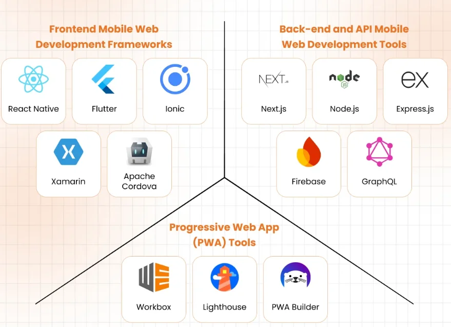
7 Best Frameworks for Mobile Web Development
The choice of frameworks plays a significant role in how efficiently your mobile web solution is built and how smoothly it performs across devices. Below are some of the most widely adopted frameworks, each offering specific strengths for frontend or backend development.
- React: Developed by Facebook, React is a JavaScript library (often treated as a framework) that enables component-based UI development and efficient rendering of mobile-optimized web interfaces. Its large ecosystem and virtual DOM architecture help enterprises build responsive, interactive mobile-web applications that feel native.
- Vue.js: Vue.js offers a progressive and lightweight framework for building mobile-friendly web apps, allowing incremental integration into existing projects while delivering reactive UI performance. Many businesses choose Vue.js when they want a balance of ease of adoption and high responsiveness for mobile web interfaces.
- Angular: Backed by Google, Angular is a comprehensive front-end framework that supports the development of enterprise-grade mobile web applications through modules, dependency injection, and mobile-first component libraries. For large-scale projects with distributed teams, Angular provides structure and governance to ensure maintainability.
- Bootstrap: Known for its mobile-first grid system and responsive components, Bootstrap facilitates rapid prototyping of mobile-friendly websites and ensures consistency across devices. Businesses often use Bootstrap for marketing sites or mobile-web interface layers because it simplifies layout, navigation, and styling.
- Node.js with Express: On the backend side, Node.js (with Express) enables fast server-side responses and supports mobile-web APIs with event-driven, non-blocking I/O, making it effective for apps with heavy real-time interactions or mobile web services. Many companies deploy Node.js in their mobile web backend to handle large volumes of mobile traffic reliably.
- Django (Python): Django is a high-level Python framework used for backend mobile-web services; it provides ORM, REST API support, and built-in security, which helps enterprises build scalable and secure mobile web backends quickly. Organizations often select Django when their mobile-web project involves complex data workflows or analytics.
- Spring Boot (Java): For enterprises that require robust backend architecture, Spring Boot offers Java developers the tools to build mobile web services, microservices, and APIs with scalability, security, and long-term maintainability in mind. Large organizations building mobile-web platforms often prefer Spring Boot because it integrates well with enterprise systems and services.
Common Programming Languages for Mobile Web Development
Selecting the right programming languages is just as important as choosing the framework when it comes to mobile web development. Below are key languages used for both the front-end and back-end of mobile-optimized web solutions.
1. Frontend Programming Languages
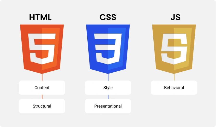
- JavaScript (including TypeScript): JavaScript remains the foundational language for mobile-web front-end development because it runs in all browsers and supports frameworks like React, Vue.js, and Angular. TypeScript adds static typing and tooling benefits, enabling teams to scale and maintain mobile-web projects more reliably. Many enterprises use JavaScript to build mobile-web portals that mirror native app behaviour, while benefitting from the broad developer talent pool.
- HTML5 / CSS3: Although not programming languages in the strict sense, HTML5 and CSS3 are essential for building mobile-friendly web layouts, responsive grids, and touch-optimized interactions. Companies rely on these languages to structure mobile web pages, manage media queries, and ensure cross-device compatibility without heavy additional frameworks.
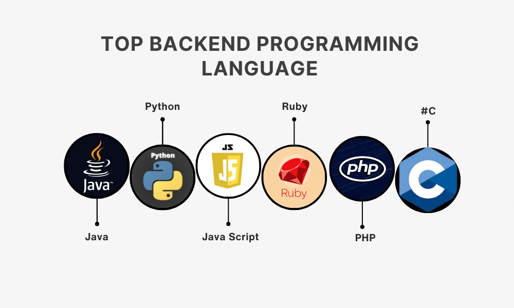
2. Backend Programming Languages
- Java: Java is widely used for mobile-web backend development thanks to its stability, strong concurrency support, and mature enterprise ecosystem. When mobile-web applications are part of large-scale enterprise systems—such as financial services or global e-commerce—Java becomes a default choice because of its long-term maintainability and security.
- Python: Python is often chosen for mobile-web backend services when the focus is on rapid delivery, data processing, and flexible APIs; its readability and large library ecosystem empower businesses to build mobile-web backends faster. An educational technology company used Python to build its mobile-web backend analytics engine and achieved faster iteration and simplified maintenance.
- Node.js (JavaScript): For mobile-web backends requiring real-time interaction, high concurrency, and unified language usage across front-end and back-end, Node.js presents a compelling choice. Several digital-service providers use Node.js for their mobile-web APIs to streamline delivery, reduce context-switching, and leverage JavaScript expertise across the stack.
How to Create a Mobile-Friendly Website?
Developing a mobile-friendly website goes beyond merely selecting the right framework or programming language. There are multiple other factors, skills, and resources that businesses must invest in throughout the entire process. Below is a brief of the basic process for developing a mobile-friendly website that your business should be aware of:
- Platform & layout selection: The development team selects the appropriate content management system (CMS) or website builder and determines a mobile-first layout strategy, ensuring that the initial design target is smaller screens rather than desktops. The decision includes choosing responsive templates or frameworks and defining breakpoints for different devices. It is important to document the device types and user contexts early to avoid rework later.
- Responsive design implementation: Designers and developers implement fluid grids, flexible imagery, and the viewport meta tag so that the site adapts seamlessly across screen sizes. They apply media queries and CSS Flexbox or Grid layouts to adjust elements for mobile device widths. Attention must be paid to touch-friendly controls, large tap targets, and readable text sizes to ensure usability.
- Content and interface optimisation: The team refines and streamlines content for mobile users by reducing text length, resizing images, simplifying forms, and removing unnecessary pop-ups or large visuals. They ensure navigation menus are compact, buttons are accessible, and essential information appears early in the page. The key is to maintain clarity and fast access while avoiding content overload on small screens.
- Performance tuning: Developers optimise page load times by minifying CSS/JavaScript, leveraging browser caching, using Content Delivery Networks (CDNs), lazy-loading images, and serving appropriately sized media. They test network speed, resource usage, and interactivity metrics to verify a fast mobile experience. This step is vital because mobile users often expect near-instant loads and will abandon slow pages.
- Testing, validation & iteration: QA teams and devs test the website on a range of real devices (smartphones, tablets) and emulators, checking layout, touch interactions, orientation changes, network behaviour, and accessibility. They use tools like Google’s Mobile-Friendly Test, PageSpeed Insights, and device labs to surface issues for fixing. Continuous iteration based on user feedback and analytics ensures the mobile-friendly website remains effective as devices and network conditions evolve.
How To Choose the Right Mobile Web Development Company?
Choosing the right service provider for mobile web development is vital when your enterprise lacks in-house experience or resources to complete the project end-to-end. The following criteria can help you evaluate outsourcing partners for mobile-optimized website creation:
- Proven mobile web portfolio: A reliable company presents recent examples of mobile-friendly websites they have built, including page-load metrics, device compatibility, and user-experience improvements.
- Responsive design and performance focus: The vendor must show optimization practices for mobile devices (fast loading, adaptive layouts, touch-friendly navigation) and share performance dashboards or testimonials.
- Cross-platform skills and full-stack capabilities: The team should include front-end and back-end developers with expertise in relevant frameworks, languages, and mobile-oriented tooling, ensuring seamless integration of mobile-web solutions.
- Clear communication and project governance: Transparent processes, milestone tracking, regular reporting, and ownership across global teams reduce risk and increase accountability in outsourcing engagements.
- Post-launch support and analytics: A competent partner offers maintenance, monitoring, A/B testing, mobile-UX insight, and iterative improvement after the initial launch, which enables sustained value rather than a one-time build.

Besides the criteria above, you can follow our blog on the best mobile app development companies in Vietnam to save time & effort for scanning the appropriate ones.
Choose Newwave Solutions for Mobile Web & App Development
If the criteria above still leave you searching for the right partner, then Newwave Solutions is a direct suggestion to support your project. With over 14 years of experience in mobile application and website development, we are committed to delivering high-quality mobile web and app services backed by experienced developers and leading technologies.
Some of the core services we provide include:
- Native App Development Services
- iOS App Development Services
- Android App Development Services
- React Native App Development Services
- Flutter App Development Services
We are pleased to deliver best-in-class services, competitive pricing, and optimized resources for your mobile web and app strategy. Explore more details about our services here.
Conclusion
From optimizing for mobile-specific APIs and touch-screen interactions to implementing robust performance optimization and responsive design techniques, the key to creating a successful mobile web development lies in a deep understanding of the mobile landscape and a relentless focus on user experience.
As you embark on your mobile web development journey, remember to continuously test, iterate, and adapt your approach to meet the ever-changing needs of your mobile audience.
Currently, Newwave Solutions offers a comprehensive suite of mobile web development solutions, tailored to your specific needs and goals. From concept to creation and beyond, our team of experienced professionals will guide you every step of the way. Contact us now if you are in need of a professional team to assist with the mobile website development process from scratch.
Contact Information:
- Head Office (Hanoi): 1F, 4F, 10F, Mitec Building, Cau Giay Ward, Hanoi City, Vietnam
- Branch Office (Tokyo): 1chōme118 Yushima, Bunkyo City, Tokyo 1130034, Japan
- Hotline: +84 985310203
- Website: https://newwavesolution.com
- Email: [email protected]
To Quang Duy is the CEO of Newwave Solutions, a leading Vietnamese software company. He is recognized as a standout technology consultant. Connect with him on LinkedIn and Twitter.


Read More Guides


Get stories in your inbox twice a month.
Let’s Connect
Let us know what you need, and out professionals will collaborate with you to find a solution that enables growth.
Leave a Reply