


GIS UI/UX Revamp forProfessional Spatial Data Analysis
Energy Infrastructure - UK - UI/UX Design - 1 Designer - 2 Months
Geospatial platforms are not designed for simple map viewing. They support professionals who need to collect, analyze and interpret spatial data with accuracy. For this UK based GIS revamp project, the client needed a clearer UI/UX direction for working with map layers, measurement tools and complex geographic datasets. Newwave Solutions redesigned the interface around a map first workspace, flexible layer control and professional analysis workflows, creating a more practical workspace for professional users who rely on spatial data to analyze conditions and support spatial analysis workflows.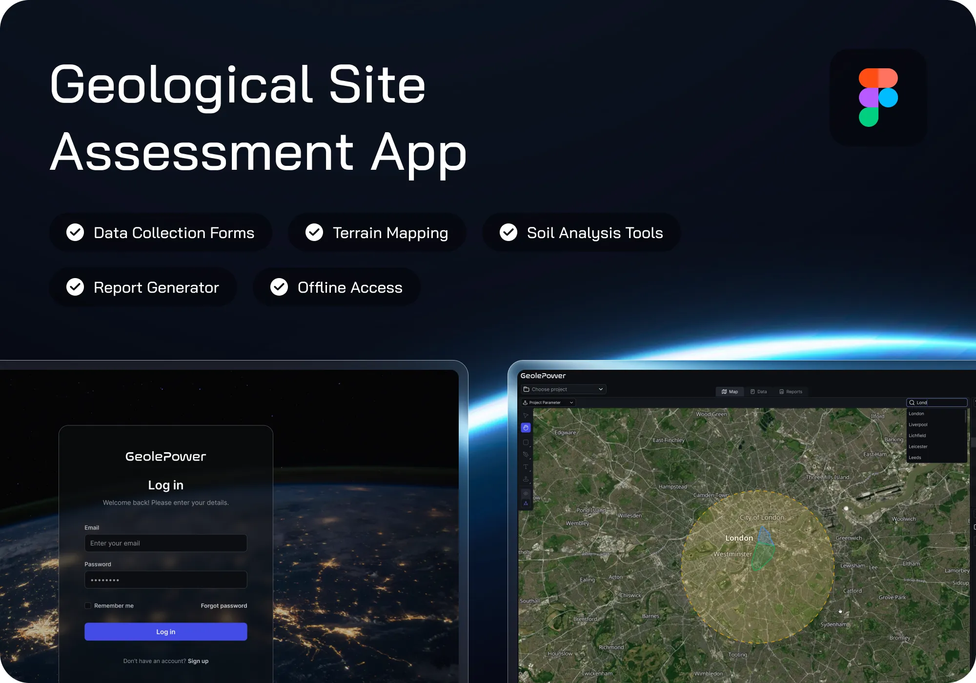
Client Context
The client is a UK based company developing a GIS platform for professional users who work with spatial data.
The product was designed for use cases that go beyond simple map viewing, including data collection, layer comparison, measurement, and geographic analysis. Its target users included GIS specialists, planners, researchers, and professionals in fields such as geography researchers, environment, and construction. For these users, the platform needed a clear workspace where map layers, tools and analytical information stayed accessible during daily work.


Business Stakes
For a GIS platform, usability is closely tied to how professional users work with spatial data. Users are not simply opening a map. They are actively comparing layers, checking geographic relationships, and measuring distance or area. They also interpret data that may support planning, research, environmental review, or construction related work. This made interface clarity important to the product experience, especially for users who needed to analyze spatial information as part of professional workflows.
Professional users needed a clear interface to interpret spatial data correctly and make decisions based on reliable map context.
Layer comparison, measurement tools and data panels had to be easy to access so users could complete GIS tasks with less navigation friction.
Users needed control over layers, legends and transparency to understand how different datasets interacted on the map.
The platform had to feel structured and precise enough for GIS engineers, planners, researchers and other expert users.
A stronger UI foundation would make future GIS features, dashboard elements and data visualization needs easier to expand.
Our Approach
Key UX Decisions

Map First Workspace
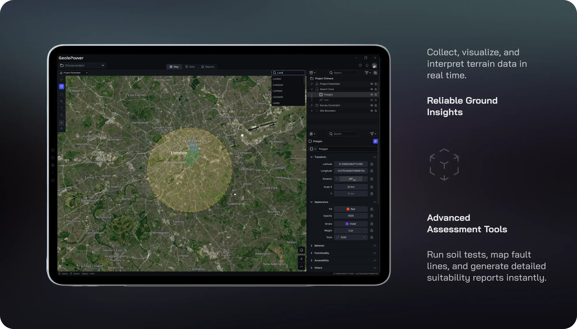
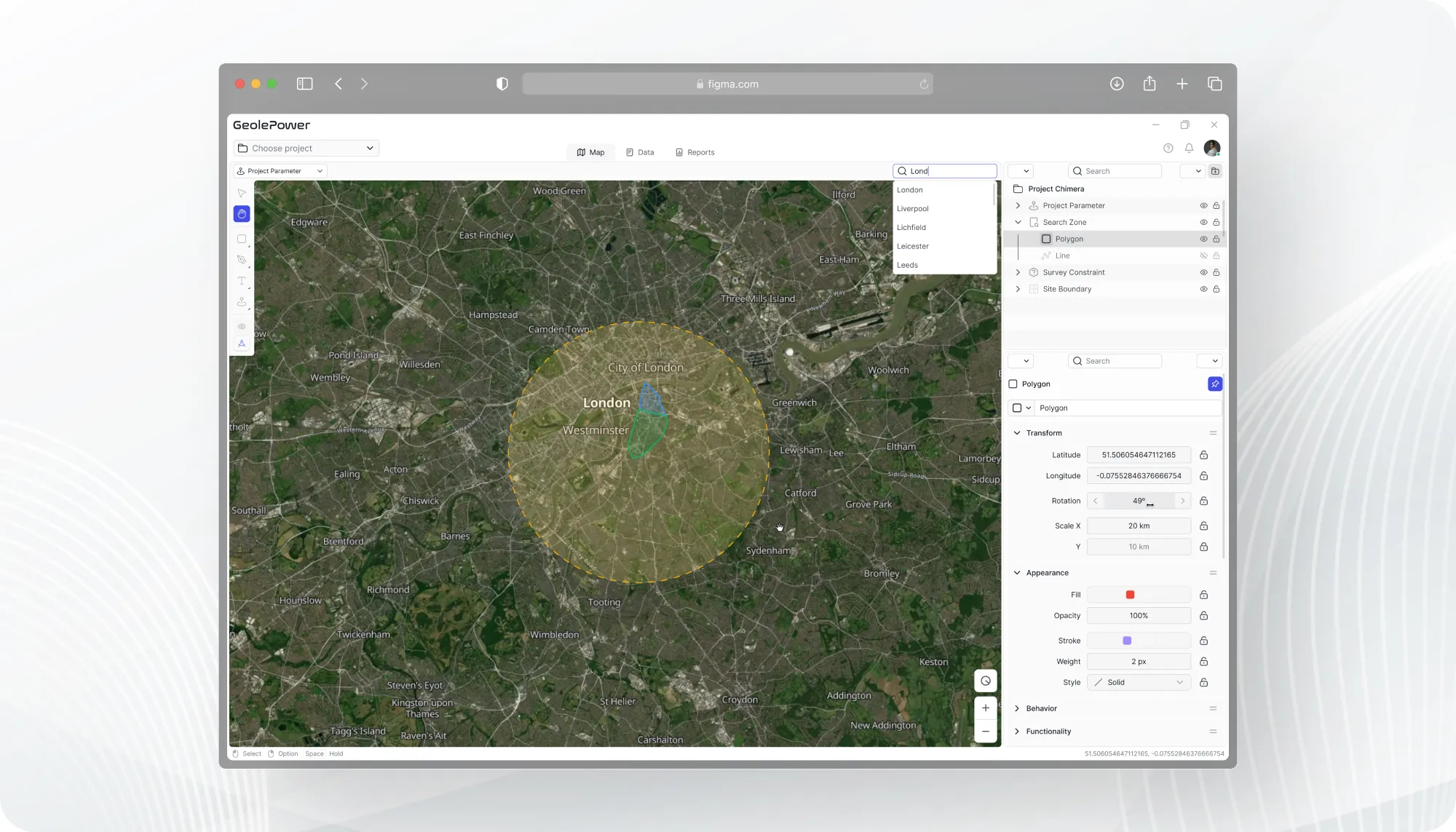
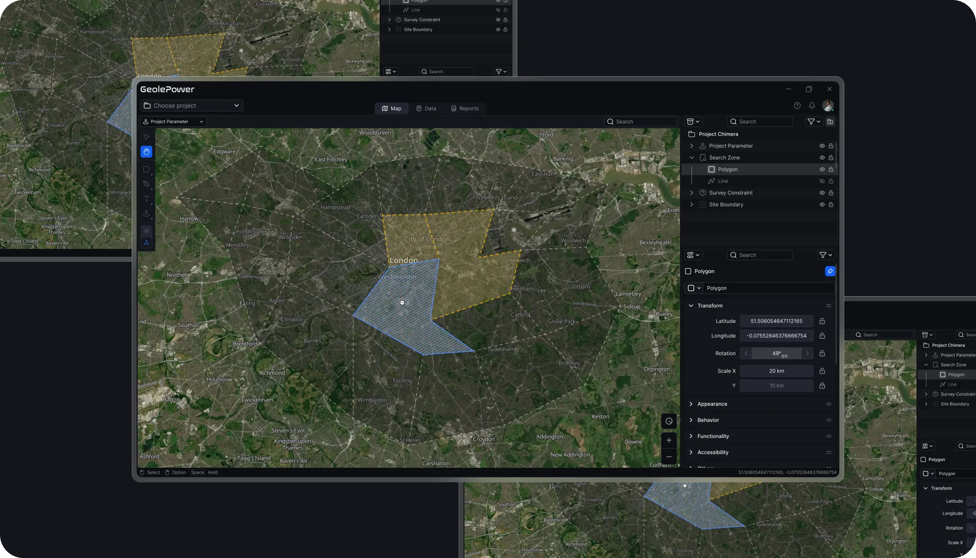
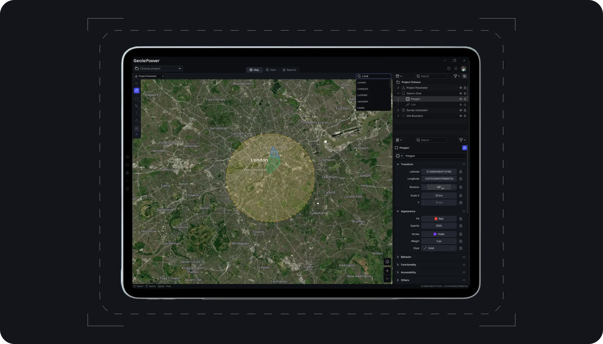
The map was treated as the main working area, not a background visual. This kept spatial context visible while users reviewed geographic objects, data layers and analytical information.

Layer Control Structure
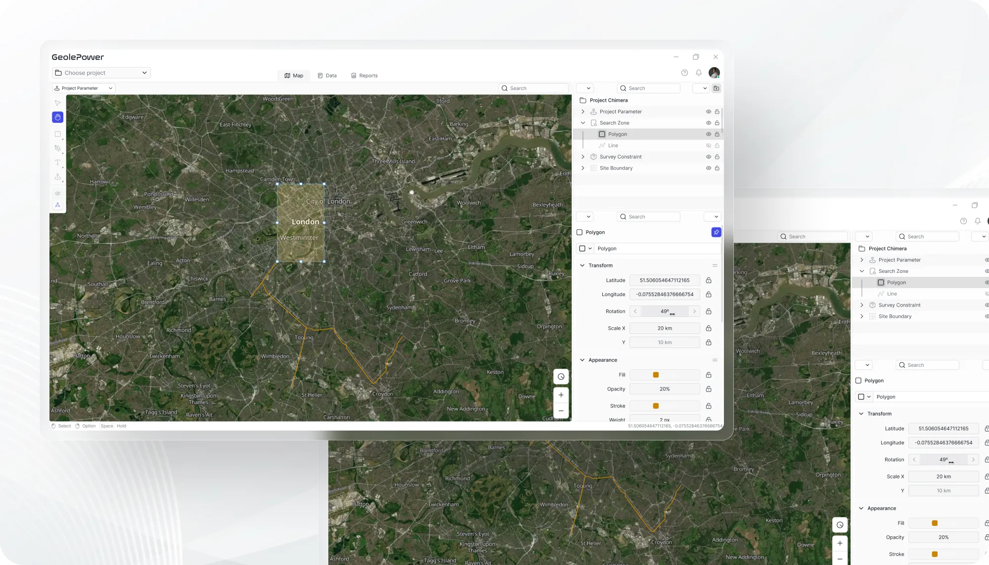
Layer visibility, legends and transparency controls became central to the experience because professional users needed to compare overlapping datasets with clarity.

Analysis Tool Accessibility
Measurement tools, object details and data panels were placed close to the map workflow, reducing navigation friction during distance, area and spatial relationship analysis.

Flexible GIS Interface Structure
The interface structure was designed to provide a flexible foundation for organizing GIS tools, data layers and workspace elements while keeping the overall experience clear and manageable for specialist users.
Risk Handling
- The main risk was a redesign that looked cleaner but made professional GIS work harder. In this type of product, simplicity can become a problem if it hides layers, separates tools from the map or removes the context users need for spatial analysis. Newwave Solutions reduced this risk by treating the map as the working environment, not just the visual center of the screen. Layer controls, measurement tools and data panels were organized around how users inspect, compare and interpret geographic information. This kept the interface clearer while preserving the functional depth, accuracy, reliability and customization needed for GIS specialist .
Product Outcomes
The prototype provided a clearer direction for a professional GIS workspace. It moved beyond a basic map viewer and designed the experience to better support spatial data planning, research and technical decision-making.
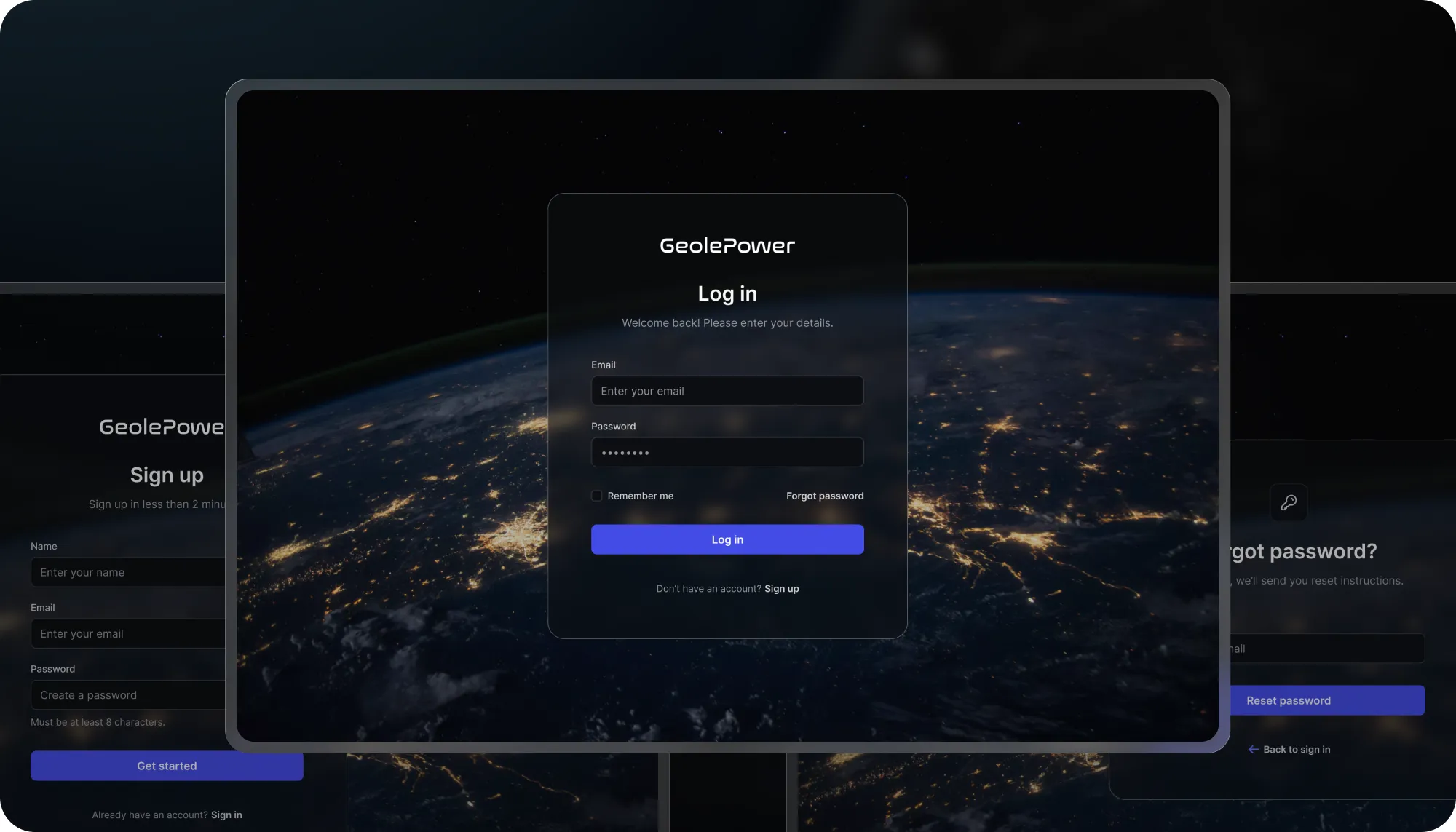
Better layer visibility, transparency and legend control reduced the friction of comparing overlapping datasets, making the product more practical for complex GIS workflows and improving its value for specialist users.
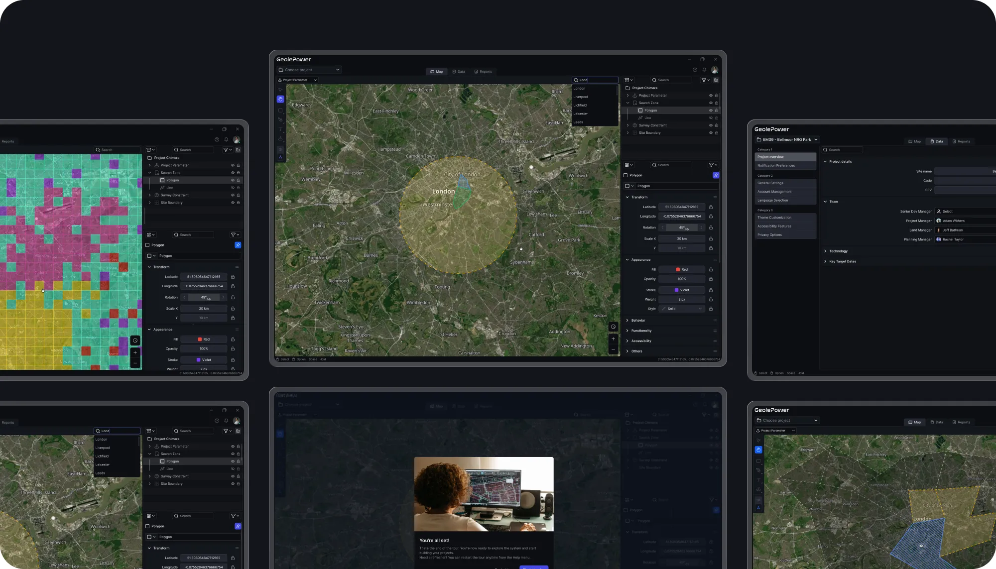
Measurement tools and object details were brought closer to the map workflow, helped reducing the effort required to complete spatial analysis tasks and making the platform more suitable for daily professional use.
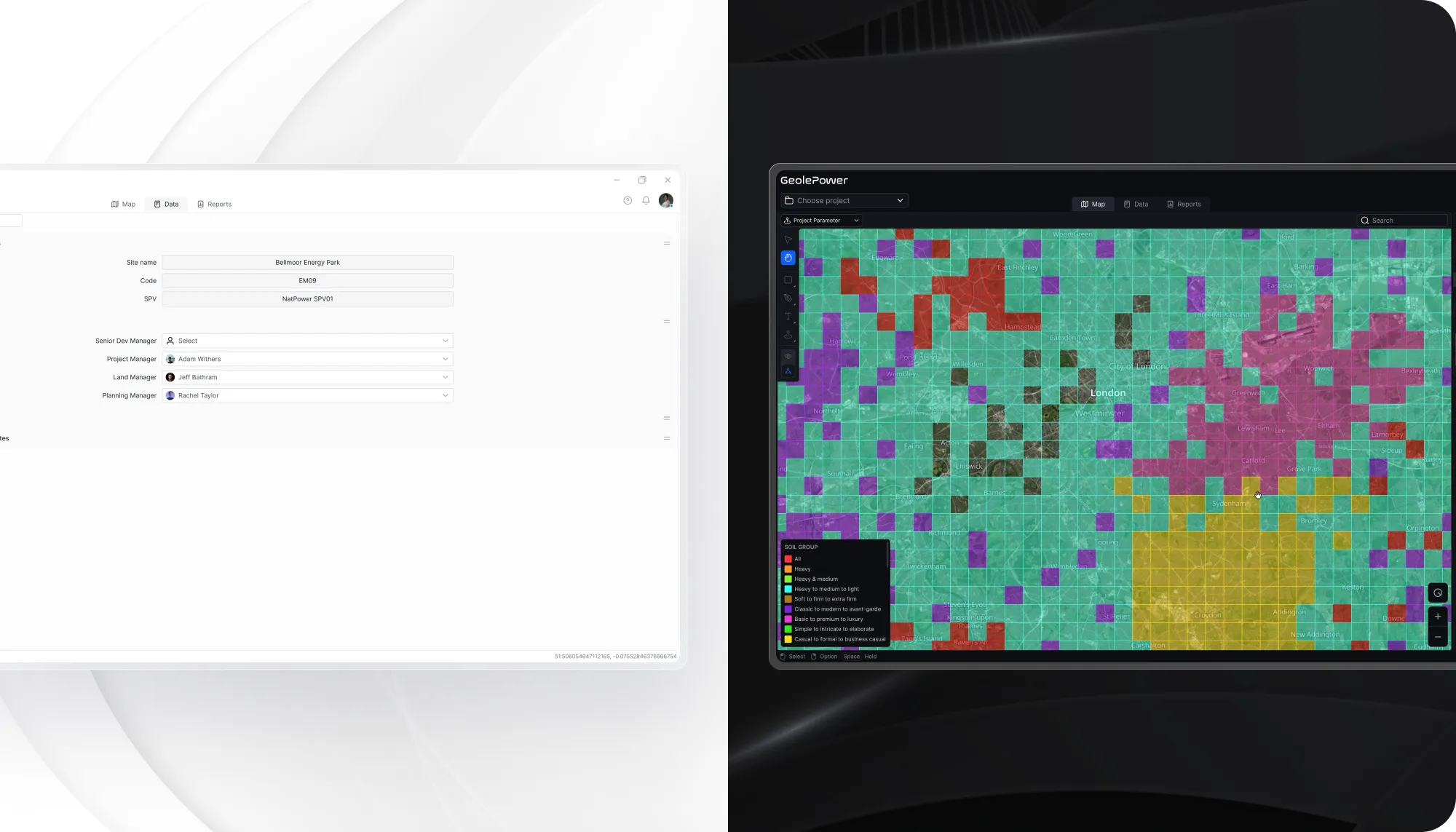
The new UI structure gave the client a scalable foundation for future GIS features, dashboard widgets, and additional data layers, reducing design fragmentation as the product continues to evolve.
Business Impact
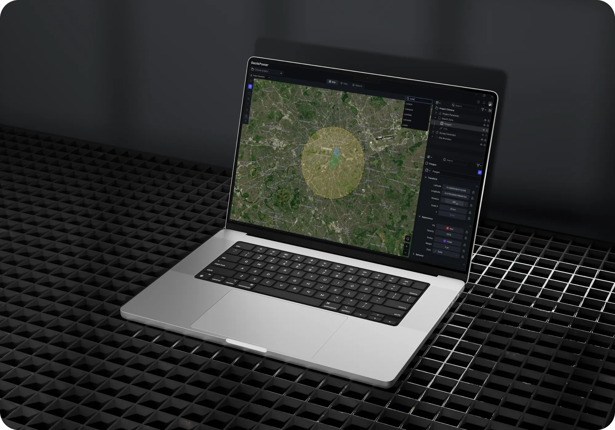
The value of the revamp was not limited to a cleaner interface. The revamp clarified the product direction as a professional GIS workspace as a professional GIS workspace, where users could analyze spatial data, compare layers, and interpret geographic relationships with more confidence. For specialist users, this distinction matters. A GIS platform creates business value when it supports decision making, not when it simply displays maps.
The new UI direction also created a more scalable base for product evolution. With the map placed at the center, clearer layer control and analysis tools kept close to the user workflow, the client gained a design foundation that could support future GIS features, dashboard components and additional data layers without making the experience feel fragmented.
Related Case Study





Let’s Build Something Extraordinary
Sign up for a 30 min no-obligation strategic session with us. Transform your Ideas into scalable reality.